.png)
.png)
.png)
Pottery can get intricate quickly. From selecting and measuring clay, throwing it on the wheel, trimming, bisque firing, applying glaze, and then firing it again, the process involves numerous steps. With thousands of clay types and glazes, each with its own techniques, these complexities are just the starting point. Keeping track of each pottery piece to assess strengths and areas for improvement becomes challenging. In addition, many potters enjoy the pottery community and would enjoy learning from and hearing about other people’s experiences and expertise.
Clay Vault is a mobile app designed to support potters throughout their pottery journey, from beginning to end. Its goal is to capture every detail of the process, helping them identify what worked well and where they can improve. Clay Vault enables potters to connect within a community, where they can share their experiences and ask questions.
10 weeks
Sole Product Designer
To better understand the challenges potters face, I explored various online sources and found several common issues:
For my primary research, I set out to gain a deeper understanding of the challenges potters face, especially when it comes to their work processes and how they track their progress. My goal was to explore the different ways potters work, how they build on their knowledge, and the unique struggles they encounter, particularly when comparing at-home potters to those working in community studios.
To gather insights, I focused on two types of primary research: ethnographic studies and interviews. I spent one month observing a pottery studio in Orange County, conducting 5 semi-structured interviews with various potters working there. This combination of direct observation and personal interviews allowed me to uncover valuable insights and organize my findings into five key themes:
These themes helped me identify both the common challenges potters face and potential areas for improvement, particularly around the tools, techniques, and systems that support their creative work.
.png)
During my month-long ethnographic studies and interviews, I identified three key groups that shape the challenges faced by potters: (1) instructors or employees, (2) novice potters, and (3) experienced potters. Understanding their distinct perspectives—thoughts, feelings, and behaviors—is crucial because each group has unique experiences and needs.


I wanted to be able to deeply understand each key group by diving deeper into their needs, pain points, and what information each group needs to keep track of. I created three personas using my empathy maps:
.png)


With a clearer understanding of my target audience, I set out to research the market and identify potential competitors. My goal was to uncover any gaps in the market and assess the strengths and weaknesses of these competitors.
.png)
With a deeper understanding of my target audience, the market, and competitors, I formulated "How Might We" (HMW) statements to explore potential solutions for the identified problem statements. This process allowed me to reframe the challenges into actionable areas of opportunity. I also categorized the statements by high, medium or low priority.
For each "How Might We" (HMW) statement, I began by brainstorming potential solutions and outlining them in text. I then translated these ideas into quick sketches to visualize how they might look in the application. This iterative process allowed me to refine and explore different design possibilities, ensuring each solution was both functional and user-friendly.


I defined acceptance criteria for each user story to clearly outline the requirements needed to mark a feature as complete. Below are examples from the high-priority user stories:
At this stage, I had a clear vision of the key features I wanted to include in the mobile application. I developed a sitemap to structure these features into hierarchical categories, prioritizing the organization and grouping to ensure a logical flow. My focus was on creating a seamless navigation experience for the user.

I used the sitemap as a foundation to design user flows for the app's main features. My primary focus was creating intuitive navigation, ensuring users could reach their destinations with minimal steps and time.

I sketched out all the screens in the user flows using pen and paper, often iterating multiple versions of each screen to find the most effective layout and design. My focus was on ensuring intuitive navigation, consistency, and an overall user-friendly experience.

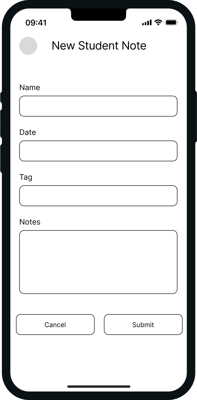
I took my paper sketches and translated them into digital wireframes using Figma. Through several iterations, I refined the design to ensure greater consistency and intuitiveness. I paid close attention to the layout, making sure that the most important features were easily accessible for the user.

.png)
.png)
.png)
.png)
.png)

I created a brand platform for Clay Vault to define its identity and provide clear guidelines for all aspects of the company. This platform ensures consistency across the brand and helps drive growth and success by aligning the company’s vision, values, and communication strategy.
With the brand platform in mind, I created a moodboard that includes imagery of potters at work, pottery studios, and various pottery pieces. I also gathered UI inspiration featuring earthy tones, primarily tans, greens, and browns. From this, I developed a color palette of warm, natural hues to align with the pottery aesthetic and reflect the organic, creative spirit of the brand.
.png)
I designed a comprehensive iOS 14 UI kit featuring a wide range of UI elements essential for building modern mobile apps. The kit includes carefully crafted components such as layout structures, system elements, typography, color palettes, icons, buttons, input fields, options, toggles, accordions, bottom navigation bars, progress indicators, cards, search fields, titles, chips, and toast notifications. I created each icon to ensure consistency. Each element is accompanied by a clear title, detailed description, and its associated components to provide a cohesive, user-friendly design system that supports intuitive and consistent app development.


I applied the color palette, typography, and icons from the style guide to my wireframes, transforming them into high-fidelity designs. I made sure the color contrast met the 4.5:1 ratio to ensure compliance with Web Content Accessibility Guidelines (WCAG). I also iterated multiple times to refine the design, focusing on improving consistency and enhancing the overall usability of the application.

.png)


.png)


I linked all the screens of the high-fidelity designs in Figma to build the interactive prototype. My focus was on ensuring clear, easy navigation throughout the app. I also ensured that touch points were large enough for easy interaction and spaced appropriately to minimize errors.
I conducted in-person moderated usability testing to identify any potential usability issues and gather insights for improving my design. To ensure the process was structured and effective, I developed a detailed testing plan that outlined participant selection and the goals for each session. I also created a usability testing script to guide the sessions and ensure I was asking the right questions to gather meaningful feedback.
I had several hypotheses going into the testing: I expected users would find it easy to sign up, add notes, send messages, and adjust their settings. However, I also anticipated that there might be confusion around the pottery icons, the different types of notes, and locating the user profile.
I focused on the following tasks for usability testing:
After organizing the usability testing findings by priority, I developed solutions to address the most critical issues. I then incorporated user feedback into a redesign, focusing on making the application more intuitive and streamlined to help users achieve their goals more easily. For example, in the before-and-after screenshots below, I made the “Edit” button more prominent and added functionality for users to delete or share their pottery projects. This change was based on feedback indicating that "Edit" was a key feature, and users were unable to share or delete their projects, which impacted their experience.

As the sole product designer for Clay Vault, I gained invaluable insights into both the pottery world and the design process. This project provided me with a unique opportunity to deeply immerse myself in a creative space and develop a user-centered solution for potters. I thoroughly enjoyed the challenge of working on the project from end to end, covering everything from UX research and ideation to UI design and implementation.
One of the most rewarding aspects of the project was the time I spent conducting ethnographic research. I dedicated an entire month to observing and interacting with potters in their studio environment. By watching them work and asking detailed questions, I was able to gain a deep understanding of their daily routines, pain points, and the challenges they face in managing their craft. This in-the-field research allowed me to collect valuable insights, which were instrumental in shaping the final product. The experience was truly eye-opening, and it reinforced the importance of user empathy in creating a solution that truly serves their needs.
However, the project was not without its challenges. One of the most significant hurdles I faced was the lack of feedback during the UI design phase. After receiving an abundance of useful feedback during the UX research and user interviews, I found myself working in isolation as the sole designer on the project. Without the constant input of other designers or stakeholders, I struggled to get the feedback I needed to refine the UI. I had to rely on my fellow design friends for feedback, which taught me to better appreciate the value of collaboration and constructive critique. This experience highlighted the importance of seeking feedback early and often throughout the design process, even if it means going outside your immediate team.
Another important takeaway from this project was the value of planning and time management. Given the scope of the project and the timeline, I quickly realized that detailed planning was essential to stay on track. I created a detailed roadmap outlining key deliverables, deadlines, and milestones, which helped me avoid scope creep and ensured that I stayed focused on delivering the MVP (Minimum Viable Product) within a reasonable timeframe. This experience reinforced the importance of balancing creativity with practicality and keeping the project aligned with both user needs and business goals.
In summary, Clay Vault was a deeply rewarding project that taught me valuable lessons in both design and process. From conducting immersive user research to managing the full design lifecycle, I gained a better understanding of how to balance user empathy with design efficiency. The challenges I encountered—especially around feedback and planning—have made me a more resilient and thoughtful designer, and I’m excited to continue applying these lessons in future projects.